Giter Site home page Giter Site logo

vmware-clarity / core Goto Github PK

View Code? Open in Web Editor NEW
162.0 11.0 42.0 278.04 MB

Clarity is a scalable, accessible, customizable, open-source design system built with web components. Works with any JavaScript framework, created for enterprises, and designed to be inclusive.

Home Page: https://clarity.design

License: MIT License

JavaScript 1.46% TypeScript 85.68% HTML 0.07% SCSS 4.88% CSS 0.26% Mustache 0.09% Shell 0.01% MDX 7.56%
design-system ui-components clarity a11y web-components react angular vue javascript

core's Introduction

Clarity

Clarity Core

Build npm version core npm version cds react npm version cds angular npm version clarity city

Clarity is an open source design system that brings together UX guidelines, design resources, and coding implementations with Web Components. This repository includes everything you need to build, customize, test, and deploy Clarity. For complete documentation, visit the Clarity website.

Getting Started

Clarity is published as five npm packages:

  • npm version core Contains the Web Components that work in any JavaScript framework.
  • npm version cds angular Contains shims for core usage in Angular environment
  • npm version cds react Contains shims for core usage in React environment
  • npm version clarity city Our open source sans-serif typeface.

Installing Clarity

Visit our documentation at https://clarity.design/get-started/

Documentation

Contributing

The Clarity project team welcomes contributions from the community. For more detailed information, see our contribution guidances.

Licenses

  • The Clarity Design System is licensed under the MIT license.

Feedback

If you find a bug or want to request a new feature, please open a GitHub issue.

Include a link to the reproduction scenario you created by forking one of the Clarity Stackblitz Templates for the version you are using at Clarity StackBlitz templates..

Support

For our support policies please visit https://clarity.design/get-started/support/

For questions, ideas, or just reaching out to the team feel free to open a discussion in our GitHub Disscussion section.

core's People

Contributors

adibwoy avatar alexmarcubytex avatar amellnik avatar andreiconstantinbytex avatar arturovt avatar astorije avatar bbogdanov avatar bdryanovski avatar bdunkz avatar chunghha avatar coryrylan avatar dtsanevmw avatar gerinjacob avatar gnomeontherun avatar hippee-lee avatar jeeyun avatar jinnie avatar kevinbuhmann avatar kingmario avatar mathisscott avatar mcosta74 avatar royling avatar shijir avatar sis0k0 avatar steve-haar avatar twittwer avatar valentin-mladenov avatar victormejia avatar williamernest avatar youdz avatar

Stargazers

 avatar  avatar  avatar  avatar  avatar  avatar  avatar  avatar  avatar  avatar  avatar  avatar  avatar  avatar  avatar  avatar  avatar  avatar  avatar  avatar  avatar  avatar  avatar  avatar  avatar  avatar  avatar  avatar  avatar  avatar  avatar  avatar  avatar  avatar  avatar  avatar  avatar  avatar  avatar  avatar  avatar  avatar  avatar  avatar  avatar  avatar  avatar  avatar  avatar  avatar  avatar  avatar  avatar  avatar  avatar  avatar  avatar  avatar  avatar  avatar  avatar  avatar  avatar  avatar  avatar  avatar  avatar  avatar  avatar  avatar  avatar  avatar  avatar  avatar  avatar  avatar  avatar  avatar  avatar  avatar  avatar  avatar  avatar  avatar  avatar  avatar  avatar  avatar  avatar  avatar  avatar  avatar  avatar  avatar  avatar  avatar  avatar  avatar  avatar  avatar

Watchers

 avatar  avatar  avatar  avatar  avatar  avatar  avatar  avatar  avatar  avatar  avatar

core's Issues

CdsDropdown onCloseChange not called when the area outside of the dropdown is clicked

Describe the bug

For CdsDropdown (and signpost and responsive dropdown), the onCloseChange callback is not called when the overlay outside of the dropdown is clicked.

How to reproduce

https://stackblitz.com/edit/clarity-react-demo-ujuhus?file=src%2FApp.tsx

Steps to reproduce the behavior:

  1. Click on button to open dropdown
  2. Click outside dropdown
  3. Note that the dropdown doesn't close when focus is trying to move outside of it

Expected behavior

The dropdown should close like the web component does: https://stackblitz.com/edit/clarity-typescript-demo-m6anoy?file=src%2Findex.ts,src%2Findex.html

Versions

Clarity project:

  • Clarity Core
  • Clarity Angular/UI

Clarity version:

  • v5.x
  • v6.x

Framework:

  • Angular
  • React
  • Vue
  • Other:

Allow customizing cds-icon using CSS transform without losing rotation

Summary

cds-icon could be more flexible if the CSS transforms were applied to the svg child element instead of the host.

  • What is the change?
    Move CSS transforms from the host into the svg element.
  • Why should it go in Clarity?
    It would make cds-icon easier to customize in cases where it is nested further inside other libraries/components. It would be possible to change the transforms with just CSS and without losing the underlying rotation.
  • Does this change impact existing behaviors? If so how?
    Yes. Any users with existing workarounds for this issue would have their icons further rotated unless they remove the workaround.

Use case

Current

If I have a caret pointing down, the HMTL looks like this:

<cds-icon shape="angle" direction="down"></cds-icon>

and I can see the following style being applied by the constructed stylesheet:

(source)

:host([direction="down"]) {
    transform: rotate(180deg);
}

This means that I will lose the transform: rotate(180deg); if I try to add any transformations like transform: translateY(10px);. It means I'll have to be mindful and use transform: rotate(180deg) translateY(10px); instead. And if it is a generic style for any cds-icon direction, I'll have to make extra adjustments for that as well.

Proposed

Maybe the current could be improved if cds-icon applied its transforms to the svg instead of the host.

:host([direction="down"]) {
	svg {
    		transform: rotate(180deg);
	}
}

This would leave the host cds-icon without any transforms, making it possible for users to add their own without worrying about overriding clarity's transforms (eg. downward rotation).

Adjust icon alignment in the left nav bar

Describe the bug

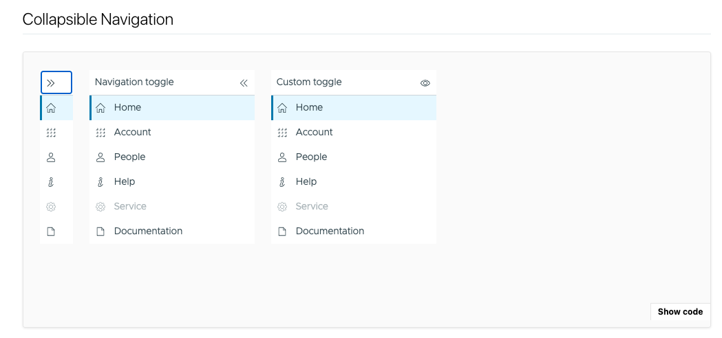
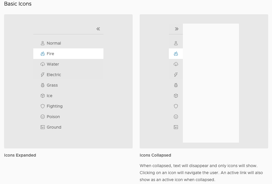
The Clarity.design website as well as VMware's Clarity Figma assets show that when navigation/the left hand nav bar is collapsed, the icons should be centered horizontally in the space. However, in the Storybook documentation, the icons are left aligned. This is a small detail, but centering the icons rather than left aligning them would help balance the visual composition of the nav bar as well as any screen it is placed within.

How to reproduce

See documentation/example in Storybook: https://clarity.design/storybook/core/?path=/story/components-navigation--page

Scroll down to the "Collapsible Navigation" section.

Expected behavior

When the nav bar is collapsed, icons are centered within the horizontal space. When the nav bar is expanded, the icons do not move/jiggle but rather stay anchored in place as the width of the nav bar expands and additional text labels are revealed.

Versions

Clarity project:

  • Clarity Core
  • Clarity Angular/UI

Clarity version:

  • v5.x
  • v6.x

Framework:

  • Angular
  • React
  • Vue
  • Other:

(React, but applies to all/is more about trying to apply Clarity’s design tokens accurately)

Device:

  • Type: [MacBook Pro]
  • OS: [iOS]
  • Browser [Chrome]
  • Version [99.0.4844.84]

Additional notes

Example of icons centered
clarity design system center aligned

Screenshot of Storybook where icons are left aligned
Storybook documentation left aligned

cds-text="body" applies unexpected margin to body tag

Describe the bug

cds-text="body" has margin applied using the ::before and ::after pseudo selectors. This creates an undesirable srollbar

How to reproduce

https://stackblitz.com/edit/clarity-angular-demo-ekhdpx?file=src%2Fapp%2Fapp.component.scss,src%2Fapp%2Fapp.component.html,src%2Fstyles.scss,src%2Findex.html

Steps to reproduce the behavior:

  1. Comment out the css in styles.scss
  2. Notice the scrollbar

Expected behavior

It should not have a scrollbar

Versions

Clarity project:

  • Clarity Core

Clarity version:

  • v5.x
  • v6.x

CdsElements memory leak issue

Describe the bug

In our project, we are using lot of cds-elements. Recently I was doing a memory profile and found that we have lot of detached HTML Elements and most of those are clarity core alert/button/icon elements.

I am not sure why these elements are still in memory even after they are removed in DOM.

How to reproduce

Sample repo: https://github.com/aravindh-nagarajan/angular-clarity-core-sample-project

Steps to reproduce the behavior:

  1. Clone the above github repo
  2. ng serve --open
  3. Stay on the first page, you can see a alert element and button element:

Screenshot 2022-05-13 at 2 32 45 PM

  1. Click on the second tab, cds elements are not present in dom, record memory snapshot:
    (memory snapshot shows the existence of detached cds elements)
    Screenshot 2022-05-13 at 2 33 39 PM

  2. Click on the third tab, cds elements are not present in dom, record memory snapshot:
    (memory snapshot shows the existence of detached cds elements)
    Screenshot 2022-05-13 at 2 35 07 PM

Expected behavior

Expect not to see these elements in memory after they are removed from DOM.

Versions

Clarity project: Clarity Core
Clarity version: v6.x
Framework: - Angular
Framework version: Angular 13
Device:

  • Type: Macbook
  • OS: iOS
  • Browser Chrome

range: track width gets out of sync with input value

Describe the bug

The color/highlight of the range input goes out of sync with the input value when the input value is changed in a controlled input by calling setValue.

How to reproduce

https://stackblitz.com/edit/vitejs-vite-qcpvwl?file=src/App.jsx

Steps to reproduce the behavior:

  1. The range slider is initially at 50/100
  2. Move it to somewhere around 75/100
  3. Click the reset button.
  4. See the colored portion is from 0 to 75 while input value is 50.

image

Expected behavior

The colored portion should change when changing input value using javascript.

Versions

Clarity project:

  • Clarity Core
  • Clarity Angular/UI

Clarity version:

  • v5.x
  • v6.x

Framework:

  • Angular
  • React
  • Vue
  • Other:

Framework version:
React 17, 18

Device:

  • Type: MacBook
  • OS: MacOS Monterey
  • Browser: Chromium
  • Version: 104

Additional notes

Add any other notes about the problem here.

Drag and Drop Icon - Usability Issues

Over the past few months we have seen some usability issues with the Drag and Drop icon. At first we did not think too much about it but after several more test and asking users what they perceive that icon to do/enable its clear that more than 50% of users are not confident in the purpose of the icon. Some users guess correctly, but also follow is up with statements like "it could also be an action menu". Me being new to VMware (7 mos) I also thought this triggered an action menu. I have added a video that highlights this issue from our previous usability test.

Please let me know if you have any questions or need more information from me at this time.

https://onevmw-my.sharepoint.com/:v:/g/personal/cdodson_vmware_com/Ed-nqhuNiypKnseN570ZJr8BP9S4U0ITWSQ38KpQ59LWqQ?e=HuOpxg

Add schematics support for @cds/[email protected]

Describe the bug

After bootstrapping a new angular project and running ng add @cds/angular the command fails to complete because Package "@cds/angular" was found but does not support schematics.

Full console output

•100% ➜ ng add @cds/angular
ℹ Using package manager: npm
✔ Found compatible package version: @cds/[email protected].
✔ Package information loaded.

The package @cds/[email protected] will be installed and executed.
Would you like to proceed? Yes
✔ Packages successfully installed.
Package "@cds/angular" was found but does not support schematics.

How to reproduce

  1. Use Angular cli to bootstrap a new application.
  2. go to terminal in new project folder and run: ng add @cds/angular

Expected behavior

@cds/angular package is installed and ready to go.

Versions

Clarity project:

  • Clarity Core
  • Clarity Angular/UI

Clarity version:

  • v5.x
  • v6.1.1

Framework:

  • Angular
  • React
  • Vue
  • Other:

Framework version:
_ie: Angular v^14.1.0 (latest)

Additional notes

If it can't be supported please remove the guidance from the documentation.

cds-checkbox-group layout 'hroizontanl-inline' showing items vertically when there are more items to display instead of wrapping

Describe the bug

When using cds-checkbox-group with more cds-checkbox elements that don't fit in the width, items are displayed with vertical layout.

How to reproduce

The following link shows the behavior with less number of elements and higher number.
https://stackblitz.com/edit/clarity-javascript-demo-rqcq7q?file=src%2Findex.js,src%2Findex.html

Expected behavior

When there are more elements it should wrap to the next line instead of a vertical alignment

Versions

Clarity project:

  • Clarity Core
  • Clarity Angular/UI

Clarity version:

  • v5.x
  • v6.x

Framework:

  • Angular
  • React
  • Vue
  • Other: vanilla JS

Device:

  • OS: Windows
  • Browser Edge chromium

setting disabled attribute while loadingState is "loading" has no effect on cds-button

Describe the bug

The disabled attribute of cds-button(from @cds/angular) is ignored, when it is set while the loadingState is loading.

We recently migrated a form from using @clr/angular to @cds/angular and encountered a most likely unintended behaviour. When the user saves the form, by clicking on the button, after the successful save the corresponding loadingStatus should be set to indicate the loading behavior to the user. Additionally the form is no longer dirty, as it does not have any unsaved changes and thus the save button should not be enabled anymore. However settings the disabled state does not take any effect after the loadingState becomes "default" again.

How to reproduce

I've build a reproduction on Stackblitz using one of the provided templates. Thank you for providing the templates, this made reporting this behavior a lot easier!

Steps to reproduce the behavior:

  1. Open example on Stackblitz
  2. Click on the "Simulate loading ..." button.
  3. Observe the "... this does not." button being enabled after the loading, even though the disabledState changed to and is still true.

Expected behavior

The cds-button should base its disabled state solely on the corresponding attribute, once the loadingState is reverted back to default.
Altering the value of disabled while the loadingState is something other than "default" should not be ignored.

Versions

Clarity project:

  • Clarity Core
  • Clarity Angular/UI

Clarity version:

  • v5.x
  • v6.x

Framework:

  • Angular
  • React
  • Vue
  • Other:

Framework version:
Angular 13

Device:

  • Type: Desktop
  • OS: Ubuntu
  • Browser Chrome
  • Version 98

Additional notes

Add any other notes about the problem here.

React: CdsModalHeaderActions uses the incorrect element name under the hood

Describe the bug

The component is producing an element that is cds-modal-header-action instead of cds-modal-header-actions . You can see the letter ‘s’ missing at the end of the created element. This causes the element to not be picked up and thus header actions do not appear at the slot they are supposed to be

How to reproduce

https://stackblitz.com/edit/clarity-react-8em3m2?file=src%2FApp.tsx,src%2Findex.html,src%2Findex.css

Expected behavior

Versions

Clarity project:

  • Clarity Core

Clarity version:

  • v5.x
  • v6.x

Framework:

  • Angular
  • React
  • Vue
  • Other:

When CdsTag has both `color` and `disabled` hover functionality still works.

Describe the bug

When CdsTag has both color and disabled hover functionality still works.

How to reproduce

https://codesandbox.io/s/cdstag-disabled-bug-eg2udj?file=/src/index.js

Steps to reproduce the behavior:

  1. create a CdsTag with both color and disabled props.
  2. hover over the rendered tag.

Expected behavior

When the tag is disabled, hovering behavior from color shouldn't function

Versions

Clarity project:

  • Clarity Core
  • Clarity Angular/UI

Clarity version:

  • v5.x
  • v6.x

Framework:

  • Angular
  • React
  • Vue
  • Other:

Framework version:
React >=16.8.0

Device:

  • Type: MacBook Pro
  • OS: macOS BigSur 11.5.2
  • Browser Chrome
  • Version 101.0.4951.54 (Official Build) (x86_64)

Incorrect export for CdsRadioPanel

Describe the bug

CdsRadioPanel is returning a wrapped version of cds-radio, not cds-radio-panel

How to reproduce

https://stackblitz.com/edit/clarity-react-penqcm?file=src%2FApp.tsx

Notice that the rendered element is a cds-radio

Expected behavior

It should be a cds-radio-panel. The issue is the name of the element on this line:

export const CdsRadioPanel = createComponent(React, 'cds-radio', RadioPanel, {}, 'CdsRadioPanel');

Versions

Clarity project:

  • Clarity Core
  • Clarity Angular/UI

Clarity version:

  • v3.x
  • v4.x
  • v5.x
  • v6.x

Framework:

  • Angular
  • React
  • Vue
  • Other:

Bring back loadingState transition/animation to cds-button

The clarity-angular loading button has a transition tied to the success state. This was not Clarion carried over to core because we did not have the animation library in place at the time.

And now that we have clarity motion we should use it to re-introduce the transition animation on the success state of the button.

We should consider whether the error state needs a transition animation as well.

CC: @colinreedmiller

To see the success state animation, go to the angular component docs (https://angular.clarity.design/documentation/buttons) and scroll down towards the bottom of the page for the loading button examples. Click on the "validate" button. You will see the checkmark fades in and grows.

API

This should just use the @animate() decorator and trigger an animation when...

@animate({
	loadingState: {
		"success": "name-of-fade-in-and-grow-animation",
		"error": "name-of-fade-in-and-grow-animation",
		"default": "name-of-fade-in-and-grow-animation"
	}
})
class CdsButton ...

The animation will probably need to run against a wrapper element inside the button. The most likely target would be .private-host.

Due to inheritance, this transition will also apply to icon buttons. With Lit 2+, animations are inherited. That's ok. No other button types inherit from CdsButton.

Conclusion

This would be a good issue for someone who is unfamiliar with clarity motion. It would be a good introduction to the animation library. The animation is simple and straightforward. The animation also only applies to an internal div inside the button. This means that there are minimal concerns about the transition affecting any child components. The transition involved is also easy to understand and interact with. I could see this as a 2-3 week focused engagement for someone new to the animations. Given meetings and distraction, it might run up to a month but I would not expect much longer than that. Someone who was already familiar with the animations library could probably implement this in a week or two.

CdsDropdown triggers an error related to the popup API

Describe the bug

When using cds-dropdown elements Chrome triggers the following error:

Found a 'popup' attribute. If you are testing the popup API, you must enable Experimental Web Platform Features. If not, note that custom attributes must start with 'data-': https://html.spec.whatwg.org/multipage/dom.html#custom-data-attribute. This usage will likely cause site breakage when the popup API ships: https://chromestatus.com/feature/5463833265045504.

The errors are not so bad when there are only one or two dropdowns. However when this is used with CdsGrid and the detail view, each row with a preview button triggers an error.

How to reproduce

  1. Go to the docs
  2. open dev tools console
  3. Observe the errors

Expected behavior

Chrome/edge will not throw errors when using the cds-dropdown element.

Versions

Clarity project:

  • Clarity Core
  • Clarity Angular/UI

Clarity version:

  • v5.x
  • v6.x

Device:

  • Type: [e.g. MacBook]
  • OS: [e.g. iOS]
  • Browser [e.g. chrome, edge]
  • Version [Chrome 104]

Additional notes

This feature is slated to ship in Chrome v110.

CdsPaginationButton: Disabled button has non-disabled styling

Describe the bug

In Clarity v6, when using <CdsPaginationButton action="first" aria-label="go to first" disabled></CdsPaginationButton>, the button is correctly disabled and has the disabled cursor icon, but the regular (i.e. non-disabled) styling:

Screen Shot 2022-06-03 at 6 42 47 PM

I do notice that Clarity's Storybook looks fine, so it may be a React wrapper bug only: https://clarity.design/storybook/core/?path=/story/components-pagination--page

How to reproduce

See https://codesandbox.io/s/pagination-button-styling-bug-6tzc7x?file=/src/App.tsx

Expected behavior

Screen Shot 2022-06-03 at 6 44 40 PM

Versions

Clarity project:

  • Clarity Core
  • Clarity Angular/UI

Clarity version:

  • v5.x
  • v6.0.1

Framework:

  • Angular
  • React
  • Vue
  • Other:

Framework version:
React 17

Device:

  • OS: MacOS
  • Browser Chrome

Highcharts does not reflow on page load in CDS Card

Describe the bug

When used in CDS Card, Highcharts charts do not reflow to the appropriate width, despite CDS Card being set to full width.

How to reproduce

https://k1yxsp.csb.app/
On the initial page load, the reflow event does not fire.

Expected behavior

When reflow is fired on page load, the chart should be full width on a full width card.

Versions

Clarity project:

  • Clarity Core
  • Clarity Angular/UI

Clarity version:

  • v3.x
  • v4.x
  • v5.x

Framework:

  • Angular
  • React
  • Vue
  • Other:

Framework version:
React >=16.8.0

Device:

  • Type: Macbook Pro
  • OS: macOS Big Sur 11.5.2
  • Browser: Chrome
  • Version: Version 96.0.4664.93 (Official Build) (x86_64)

cds-navigation: nav items added after initial render are visually hidden

Describe the bug

When a nav item is added to the Navigation component after it's initial render, the text is visually hidden with the screen reader class and not visible.

The repro is in react, but I don't think this is react specific.

How to reproduce

https://stackblitz.com/edit/clarity-react-demo-bxd4di?file=src%2Findex.html,src%2FApp.tsx

Steps to reproduce the behavior:

  1. Notice that the nav items are created in the useEffect after the initial render
  2. The text isn't visible in the left nav, almost as if it's considering the nav is collapsed

Expected behavior

The nav text is visible

Versions

Clarity version:

  • v5.x
  • v6.x

Framework:

  • Angular
  • React
  • Vue
  • Other:

Framework version:
ie: Angular 11

Device:

  • Type: [e.g. MacBook]
  • OS: [e.g. iOS]
  • Browser [e.g. chrome, safari]
  • Version [e.g. 22]

Additional notes

Add any other notes about the problem here.

Cannot build vite project using clarity core v6

Describe the bug

I'm using Vite Vue and React both. After installing @cds/core @cds/react v6.0.0 and importing a clarity button component for example, the vite project build always raises the below error. Only when I downgrade clarity to 5.6.4, the below issue disappear.

[vite]: Rollup failed to resolve import "@cds/core/icon/shapes/exclamation-circle.js" from "node_modules/@cds/core/forms/register.js". This is most likely unintended because it can break your application at runtime. If you do want to externalize this module explicitly add it to build.rollupOptions.external error during build:

Versions

Clarity project:

  • Clarity Core
  • Clarity Angular/UI

Clarity version:

  • v5.x
  • v6.x

Framework:

  • Angular
  • React
  • Vue
  • Other:

Framework version:

Vite

PageDown key in clr-modal does not move the sidebar/scrollbar down anymore...

Describe the bug

PageDown key in clr-modal does not move the sidebar down anymore...

How to reproduce

Go to a cds-modal / clr-modal
press PageDown on keyboard
check if the scrollbar moves down.

Expected behavior

moves with pressing PageDown/PageUp

Versions

Clarity version:

  • [x ] v5.x
  • v6.x

Framework:

  • [x ] Angular
  • React
  • Vue
  • Other:

Device:

  • Type: PC
  • OS: Windows10
  • Browser : Edge and Chrome

Angular: Alignment issue with reusable component inside CDSFormGroup and multiple CDSFormGroup's are required to resolve

Describe the bug

  1. Alignment is distorted when a reusable component is included within <cds-form-group>.
  2. HTML5 elements used within a <cds-form-group> are not displayed and a lot of whitespace is shown. When displayed the alignment is not proper.
  3. Multiple <cds-form-group> elements are required to resolve the alignment issue where only one is required for the entire form.

How to reproduce

Please take a look at the stackblitz.

In the stackblitz, I am having a form with two reusable components, <general-info>, <description>. Elements defined with in the reusable components when rendered, the control width is shrinked. "Description", "ISO Location" alignments are different even though the html used to render both of them is same.

The Details section is separated with a <hr/> tag which is not rendered even though it is present in the DOM. Lot of white space seen. We can use <cds-divider> component, but the General section and the Details section divider is not aligned when using the reusable component.

We are able to resolve the issues by having reusable components containing their own <cds-form-group> and in the main form component, create multiple form groups before and after a reusable component. Now the problem is the spacing between form group elements is not proper and they look like overlapped (WorkRegion, ProjectManager. WayBill, Description, ISO Location).

Expected behavior

  1. We should be using a single form group element for the entire form instead of multiple form group elements. The reusable components should inherit the form group attributes defined on the parent instead of defining their own form group.
  2. Any HTML5 elements included within a form group should be rendered properly.
  3. Spacing, Alignments should be proper.

Versions

Clarity project:

  • Clarity Core
  • Clarity Angular/UI

Clarity version:

  • v5.x
  • v6.x

Framework:

  • Angular
  • React
  • Vue
  • Other:

Framework version:
Angular 13

Device:

  • Type: Dell Latitude
  • OS: Windows 10
  • Browser: chrome, edge chromium

Additional notes

We built all of our forms using @clr/angular and wanted to migrate to @cds/core, @cds/angular. All the forms use similar reusable components and the structure as defined in the stackblitz. We started the POC for migration and these are some major issues observed. Appreciate your response on the issue

Custom elements supporting `disabled` need to be `formAssociated`

Describe the bug

According to this spec on disabled: https://html.spec.whatwg.org/multipage/semantics-other.html#disabled-elements

An element is said to be actually disabled if it is one of the following:

a form-associated custom element that is disabled

Clarity core custom elements don't appear to set formAssociated. We discovered this when testing-library/user-event changed their isDisabled check for user interactions to enforce this: https://github.com/testing-library/user-event/blame/main/src/utils/misc/isDisabled.ts#L26-L33

If this is part of the spec for disabled custom elements then this may affect more than just testing-library/user-event. However this is the first time we've seen any lib enforce it. It seems to be fine in an actual browser.

How to reproduce

I'll update this with a repro, but in the meantime:

Steps to reproduce the behavior:

  1. Render a disabled CdsButton such as:
  <CdsButton disabled onClick={() => alert('should not happen')}>
    Disabled button
  </CdsButton>
  1. Using testing-library/[email protected] or later,
  user.click(screen.getByRole('button', { name: 'Disabled button' }))
  1. Click should not happen. Instead, it does.

Expected behavior

user.click on a disabled cds-button (and other relevant form-like elements) shouldn't trigger onClick

Versions

Clarity project:

  • Clarity Core
  • Clarity Angular/UI

Clarity version:

  • v5.x
  • v6.x (v6.1.0)

Framework:

  • Angular
  • React
  • Vue
  • Other:

Framework version:
React 18.2.0

Device:

  • Type: [e.g. MacBook] Macbook
  • OS: [e.g. iOS] Monterey
  • Browser [e.g. chrome, safari] Chrome
  • Version [e.g. 22] 104

Additional notes

For those with access to CloudHealth's github, example is here: https://github.com/CloudHealth/cht-ui-component-lib/blob/cf527be82f915accf3e3306b290bccc48c25f64f/test/src/ButtonMenu.test.tsx#L122

cds-radio-panel checked visual doesn't change when another panel in the same group is selected

Describe the bug

When rendering multiple radio-panels inside of a cds-radio-group, the other panels don't switch to an unchecked display visually when another panel is checked.

How to reproduce

https://stackblitz.com/edit/clarity-cdn-nlgyj2?file=index.html

Steps to reproduce the behavior:

  1. Notice how clicking "My Radio 1" and then "My Radio 2" unchecks "My Radio 1"
  2. When repeating the same behavior with the radio panel

Expected behavior

A clear and concise description of what you expected to happen.

Versions

Clarity project:

  • Clarity Core

Clarity version:

  • v3.x
  • v4.x
  • v5.x
  • v6.x

Framework:

  • Angular
  • React
  • Vue
  • Other: Vanilla JS

Device:

  • Browser: Chrome
  • Version 100.0.4896.88

Filter for Datagrid in cds-modal is obscured

Describe the bug

We've been moving over the Cds versions of components but I have a need to display some data in a Datagrid. When I have a Clr Datagrid in a Cds Modal and column filters are enabled, the filter boxes are displayed behind the modal content and are inaccessible.

I've tried adding a high z-index to the filter with the following but although the filter is now visible, you can't enter text into the input box.

.datagrid-filter {
  z-index: 1000001;
}

How to reproduce

Stackblitz: https://stackblitz.com/edit/clarity-light-theme-clr12-cds5-thpyqk?file=src/app/app.component.ts

Steps to reproduce the behavior:

  1. Click on the button titled "Click Me"
  2. Click on the filter icon in the header of "User ID"
  3. The box that should display the filter input box displays behind the modal.

Expected behavior

The filter input box should appear in front of the modal content and the input box should accept text input.

Versions

Clarity version:

  • v12.x
  • v13.x
  • Other:

Framework:

  • Angular
  • React
  • Vue
  • Other:

Framework version:
Angular 12, 13

Device:

  • Type: MacBook
  • OS: macOS
  • Browser: Vivaldi/Chrome
  • Version: 5.3.2679.68

CdsAlert: close button is slightly misaligned in v6

Describe the bug

The bigger hit target on the close button is really great, unfortunately it comes with a slight misalignment compared to v5:

v5 v6
Screen Shot 2022-06-08 at 8 16 33 PM Screen Shot 2022-06-08 at 8 15 56 PM

How to reproduce

Reproduction sandbox: https://codesandbox.io/s/alert-close-btn-issue-v6-3spmvx?file=/src/App.tsx

Screen Shot 2022-06-08 at 8 12 38 PM

Weirdly I couldn't reproduce the "correct" behavior we're seeing in v5 on a sandbox, but we do get the correct alignment in our component library as shown on the screenshots here.
For reference: https://codesandbox.io/s/alert-close-btn-issue-v5-7eve0z?file=/src/App.tsx

Expected behavior

Screen Shot 2022-06-08 at 8 13 47 PM

Versions

Clarity project:

  • Clarity Core
  • Clarity Angular/UI

Clarity version:

  • v5.x
  • v6.x

Framework:

  • Angular
  • React
  • Vue
  • Other:

Framework version:

React 17

React: CdsModal doesn't display when setting hidden={false}

Describe the bug

When setting the hidden prop to false on the CdsModal component, the modal is not visible. React sends a string to the DOM, so the attribute is hidden="false" but the hidden attribute should be removed, not set to false. See the spect https://www.w3.org/TR/2008/WD-html5-20080610/semantics.html#boolean

How to reproduce

https://stackblitz.com/edit/clarity-react-8em3m2?file=src%2FApp.tsx

Notice how the modal only appears if you conditionally render the modal only when hidden is false, or if you convert false to undefined

Expected behavior

The Modal would be visible with hidden=false like it is in V5: https://codesandbox.io/s/goofy-cori-wyy4eq?file=/src/App.tsx

Versions

Clarity project:

  • Clarity Core
  • Clarity Angular/UI

Clarity version:

  • v5.x
  • v6.x

Framework:

  • Angular
  • React
  • Vue
  • Other:

Framework version:
ie: Angular 11

Device:

  • Type: [e.g. MacBook]
  • OS: [e.g. iOS]
  • Browser [e.g. chrome, safari]
  • Version [e.g. 22]

Additional notes

Lit issue: lit/lit#3053

Related (closed) React Issue: facebook/react#9230 (comment)

Datalist control does not respect clrLabelSize value above 2 in horizontal or compact layouts

Describe the bug

When specifying clrLabelSize > 2 in a compact or horizontal layout, the datalist component is ignoring clrLabelSize.

How to reproduce

Clarity Angular v13 and Core v6 Stackblitz.

Steps to reproduce the behavior:

  1. In a basic Clarity Core/Angular app, set your form clrLayout="compact", "horizontal" or default and clrLabelSize="4"
  2. Add various controls such as input, select, etc., but be sure to include the datalist control
  3. All controls will properly respect clrLabelSize="4" for layout, except for the datalist control

Expected behavior

The datalist control should respect the clrLabelSize value of 4

Versions

Clarity project:

  • Clarity Core
  • Clarity Angular/UI

Clarity version:

  • v5.x
  • v6.x

Framework:

  • Angular
  • React
  • Vue
  • Other:

Framework version:
Angular v13

Device:

  • Type: [Dell Notebook]
  • OS: [Windows 10]
  • Browser: [Edge (Chromium)]
  • Version: [103]

Additional notes

This is an issue in Edge 103 and Chrome 103. Note from one of our developers, "I noticed in Clarity source code that the label columns were increased from 2 to 4 for most of the form controls except the datalist. Before the change, label was given 2 columns width and form control 10 columns. After the change, it is label 4 columns and form control 8 columns, except for datalist which appears to remain at 2 columns."

image

Form component not worked as expected

Describe the bug

Try the form component in index.html and the form don't displabed as expected

How to reproduce

<!DOCTYPE html>
<html lang="en">
<head>
  <meta charset="utf-8">
  <meta content="width=device-width, initial-scale=1.0" name="viewport">
  <title> Index</title>
  <meta content="" name="description">
  <meta content="" name="keywords">
  <link rel="stylesheet" href="https://unpkg.com/@clr/ui/clr-ui.min.css" />
</head>
<body>
    <form clrForm>
        <clr-input-container>
          <label>Field 1 label</label>
          <input clrInput type="text" name="example" />
        </clr-input-container>
        <clr-input-container>
          <label>Field 2 label</label>
          <input clrInput type="text" name="example" />
        </clr-input-container>
      </form>
</body>
</html>

Expected behavior

https://storybook.clarity.design/?path=/docs/forms-form--default

Versions

Clarity project:
Clarity Core
latest

Framework:
No framework

  • Type: MacBook
  • OS: iOS
  • Browser Firefox
    103.0 (64-bit)

chore: 6.x stable checklist

6.0 stable checklist

cds-icon causes memory leak and slow Angular v13 unit tests

cds-icon subscribes to state updates observable GlobalStateService.stateUpdates in its firstUpdated callback.

The unsubscribe logic for GlobalStateService.stateUpdates is placed in the disconnectCallback.

The memory leak happens because it's not guaranteed that disconnectCallback will be called after firstUpdated in terms of callback execution order. There are situations where disconnectCallback is called first and then firstUpdated is called. When this happens and disconnectCallback is called first, the cds-icon will 'leak' subscribers to the GlobalStateService.stateUpdates observable. These leaked subscribers are never unsubscribed and this leads to the memory leak.

The reason why disconnectCallback is sometimes called before firstUpdated is related to the way LitElement.requestUpdated() works - this is the code https://github.com/lit/lit/blob/93d671feab82688a79fc60ba22cf204fa4ca02ec/packages/reactive-element/src/reactive-element.ts#L1150.

In short, requestUpdated() works asynchronously which means the firstUpdated callback will be called asynchronously. Since disconnectCallback works synchronously there are situations where firstUpdated will be called after disconnectCallback.

How to reproduce

To reproduce the problem, you can run unit test spec file using Angular 13 with testing module teardown.destroyAfterEach enabled (teardown is enabled by default in Angular 13).
In the spec below, every it will leak 1 subscriber to the GlobalStateService.stateUpdates, that's why the expectations (expect) in the consecutive it(...) are for 1, 2, 3 and 4 subscribers respectively.

NOTE: if you run the spec file, make sure the spec randomized execution is disabled in your karma.conf.js. Also, you must use Angular 13 with teardown enabled. By doing this, the disconnectCallback will be called before firstUpdated consistently. In Angular 13 projects (with teardown enabled) that have a lot of unit tests, these leaked subscribers cause significant test slowdown as the test execution progresses.

SPEC FILE CODE
import { Component, CUSTOM_ELEMENTS_SCHEMA } from '@angular/core';
import { TestBed } from '@angular/core/testing';

import { ClarityIcons, popOutIcon } from '@cds/core/icon';
import { CdsModule } from '@cds/angular';
import { GlobalStateService } from '@cds/core/internal';

ClarityIcons.addIcons(popOutIcon);

@Component({
  selector: 'test-component',
  template: `
     <cds-icon shape="pop-out"></cds-icon>
  `
})
export class TestComponent {
}

describe('Test GlobalStateService.stateUpdates.subscriptions Memory Leak', () => {
  beforeEach(() => {
    TestBed.configureTestingModule({
      imports: [
        CdsModule
      ],
      declarations: [
        TestComponent
      ],
      schemas: [
        CUSTOM_ELEMENTS_SCHEMA
      ],
      teardown: {
        // With Angular 13 'destroyAfterEach' is enabled by default.
        destroyAfterEach: true
      }
    })
  });

  it('create icon for the first time - currently there are no subscribers in the global service', () => {
    expect(((GlobalStateService.stateUpdates as any).subscriptions as any[]).length).toEqual(0);

    const fixture = TestBed.createComponent(TestComponent);
    fixture.detectChanges();

    // At this point the 'cds-icon' element is added to the DOM and element's connectedCallback() has been called.
    // But there are still no subscribers in the global service because CdsIcon.firstUpdated() callback is not called yet.
    expect(((GlobalStateService.stateUpdates as any).subscriptions as any[]).length).toEqual(0);
  });

  it('verify 1 subscriber is currently leaked in the global service', () => {
    expect(((GlobalStateService.stateUpdates as any).subscriptions as any[]).length).toEqual(1);

    const fixture = TestBed.createComponent(TestComponent);
    fixture.detectChanges();

    expect(((GlobalStateService.stateUpdates as any).subscriptions as any[]).length).toEqual(1);
  });

  it('verify 2 subscribers are currently leaked in the global service', () => {
    expect(((GlobalStateService.stateUpdates as any).subscriptions as any[]).length).toEqual(2);

    const fixture = TestBed.createComponent(TestComponent);
    fixture.detectChanges();

    expect(((GlobalStateService.stateUpdates as any).subscriptions as any[]).length).toEqual(2);
  });

  it('verify 3 subscribers are currently leaked in the global service', () => {
    expect(((GlobalStateService.stateUpdates as any).subscriptions as any[]).length).toEqual(3);

    const fixture = TestBed.createComponent(TestComponent);
    fixture.detectChanges();

    expect(((GlobalStateService.stateUpdates as any).subscriptions as any[]).length).toEqual(3);
  });
});

How to reproduce in production code
The easiest way to reproduce the issue is with the following code:

const icon = document.createElement('cds-icon');
icon.setAttribute('shape', 'pop-out');
document.body.appendChild(icon);
icon.remove();

Creating an icon element, attaching it to the DOM and then immediately removing it will result in leaked subscribers.

Here is a stackblitz that uses the code above to leak 1000 subscriptions https://stackblitz.com/edit/clarity-dark-theme-clr13-cds6-duukxq?file=src/app/app.component.html

Expected behavior

Adding and removing cds-icon from the DOM should not leak subscribers to GlobalStateService.stateUpdates.

It seems firstUpdated() callback is not the place where cds-icon (and possibly other components from Clarity Core) should subscribe to GlobalStateService.stateUpdates.
Probably, the connectedCallback() is the place where the subscribe logic should be placed.

Versions

Clarity project:

  • Clarity Core
  • Clarity Angular/UI

Clarity version:

  • v3.x
  • v4.x
  • v5.x

Framework:

  • Angular
  • React
  • Vue
  • Other:

Framework version:
Angular 13

Device:

  • Type: MacBook
  • OS: MacOS Monterey
  • Browser: Chrome
  • Version: 100.0.4896.127
Alert web component does not detect the overflow in some cases

Describe the bug

We are using the alert component in my team and we have encountered a problem. The content that we are introducing inside the slot has overflow, however the web component does not seem to detect it and therefore allow the scroll to be activated.

How to reproduce

Here we see an example using the same content inside the web component and outside the web component. We can see that in the second example (outside the web component) a scroll bar is displayed. That is the desired behaviour.

https://stackblitz.com/edit/clarity-javascript-demo-sjwgpi?file=src%2Findex.html

Steps to reproduce the behavior:

  1. Go to the index
  2. See the example showing a code content inside the alert box and outside the alert box

image

Expected behavior

We can see that in the second example (outside the web component) a scroll bar is displayed. That is the desired behaviour.

image

Versions

Clarity project:

  • [x ] Clarity Core
  • Clarity Angular/UI

Clarity version:

  • v5.x
  • [ x] v6.x

Framework:

  • Angular
  • React
  • Vue
  • [x ] Other:

Framework version:
Vanilla Javascript and HTML

Device:

  • Type: [MacBook]
  • OS: [iOS]
  • Browser [chrome]
  • Version [103.0.5060.134 ]

Additional notes

Add any other notes about the problem here.

cds-input styling is lost when using `size` attribute

This is ported from vmware-archive/clarity#6646

Describe the bug

The Editable pagination number example of the Pagination component from docs/Storybook lost its styles for the pagination number input.

It's caused by vmware-archive/clarity#6377, which also affects cds-input with a size attribute, not only cds-select. But perhaps it was intention?

How to reproduce

https://stackblitz.com/edit/clarity-cdn-wnbbpm?file=index.html

Note the difference in input behavior when using the size attribute on the input

Expected behavior

This appears to be caused by: vmware-archive/clarity#6377

Versions

Clarity version:

  • v3.x
  • v4.x
  • v5.x
  • v6.x

Additional notes

Add any other notes about the problem here.

Add support for cds-layout to slotted elements in CdsCard

Describe the bug

Core web components should support cds-layout styles for content projected into cds-card slots. When using CdsCard with a vertical layout, slotted elements do not respond to any of the cds-layout style or spaces.

How to reproduce

Here is a simple stackblitz with one card and several items projected.

Expected behavior

When projecting elements into a cds-card with the attribute cds-layout="vertical align:fill gap:lg" e.g when writing something like this:

    <cds-card
      demo
      cds-layout="vertical align:fill gap:lg"
    >
      <span
        id="confluence-card"
        cds-text="section"
        cds-layout="align:horizontal-center"
      >
        Supported Build Systems
      </span>
      <ul cds-layout="align:stretch">
        <li>GoBuild</li>
        <li>ConcourseCI</li>
      </ul>
      <cds-divider
        cds-layout="align:bottom"
        cds-card-remove-margin
      ></cds-divider>
      <div cds-layout="align:bottom" cds-text="body light">
        Build Insight processes logs from the above build systems to extract
        insight into build health and security information.
      </div>
    </cds-card>

In this case, the children elements (respectively: span, ul, cds-divider, div) should have core styles for: vertical, align:fill and gap:lg applied.

Versions

Clarity project:

  • Clarity Core
  • Clarity Angular/UI

Clarity version:

  • v5.x
  • v6@latest

Framework:

n/a

Other

See CdsNavigation demos for example of expected behavior. Items projected into cds-navigation can use any of the cds-layout tokens to control the layout, spacing and alignment of projected elements. CdsCard should follow this pattern similar to navigation and other components.

CdsTextarea value isn't grayed out when disabled

Describe the bug

The value of a disabled CdsTextarea isn't grayed out when compared to a CdsInput

Screen Shot 2022-09-07 at 4 16 15 PM

How to reproduce

Codesandbox on core+react 6.1.3: https://codesandbox.io/s/disabled-cdstextarea-7nlxn8?file=/src/App.tsx

Steps to reproduce the behavior:

  1. Open codesandbox
  2. Compare the two disabled elements

Expected behavior

I would expect the color of the value of the disabled CdsTextarea to match CdsInput

Versions

Clarity project:

  • Clarity Core
  • Clarity Angular/UI

Clarity version:

  • v5.x
  • v6.x

Framework:

  • Angular
  • React
  • Vue
  • Other:

Framework version:
React 17

Device:

  • Type: [e.g. MacBook] MacBook
  • OS: [e.g. iOS] Big Sur
  • Browser [e.g. chrome, safari] Chrome
  • Version [e.g. 22] 105

React unit tests failing with node 16

Describe the bug

Something in node 16 can make jest snapshot tests (or any tests that log the output of the dom) fail in node 16. Unfortunately, it appears to be the combination of node 16 plus some other setting/dependency because it doesn't happen all the time with node 16.

How to reproduce

This happens in

https://github.com/steve-haar/core/tree/topic/beta-repo-redo

Steps to reproduce the behavior:

  1. nvm use 16
  2. npm install
  3. npm build:ci

Note that the react snapshot tests fail for tests that have nested web-components.

Expected behavior

Versions

Clarity project:

  • Clarity Core
  • Clarity Angular/UI

Clarity version:

  • v3.x
  • v4.x
  • v5.x
  • v6.x

Framework:

  • Angular
  • React
  • Vue
  • Other:

Additional notes

In the clarity react tests, it only seems to happen with nested web components (Accordion in AccordionGroup, for example). But others have reported it happening with CdsTag, CdsInput, etc.

Typography: h and p styles don't work in dark-mode

Describe the bug

There is no dark mode equivalent for the h and p styles in storybook, they show up as dark text

How to reproduce

scroll down to the headings h1-h6 and the paragraphs p1-p6 sections

https://clarity.design/storybook/core/?path=/story/foundation-typography--page&globals=theme:dark

Expected behavior

The text is readable on a dark background

Versions

Clarity project:

  • Clarity Core
  • Clarity Angular/UI

Clarity version:

  • v5.x
  • v6.x

Framework:

  • Angular
  • React
  • Vue
  • Other:

Framework version:
ie: Angular 11

Device:

  • Type: [e.g. MacBook]
  • OS: [e.g. iOS]
  • Browser [e.g. chrome, safari]
  • Version [e.g. 22]

Additional notes

Add any other notes about the problem here.

clr-ui shim issues

Describe the bug

Some of the ng components aren't styled correctly with the shim.

https://6282ae49fdaf3a0c394b6c68--clr-angular-demo.netlify.app/

Components

Accordion (light mode)

  • clr-accordion-header background color (--clr-accordion-header-background-color) should be --cds-alias-object-container-background-tint, not --cds-alias-object-app-background.
  • clr-accordion-header text color (--clr-accordion-text-color) should be --cds-alias-object-interaction-color
  • clr-accordion-title font-weight? Core doesn't have the same concept of a title vs description that ng does
  • Spacing between caret and title (will require ng change to add CSS var)

Alert (light mode)

  • danger alert font color should be --cds-global-typography-color-400 not --cds-global-typography-color-500
  • warning font color --clr-alert-warning-font-color should be --cds-global-color-construction-900 not var(--cds-global-color-black)
  • info font color --clr-alert-info-font-color should be --cds-global-typography-color-400 not --cds-global-typography-color-500
  • success font color --clr-alert-success-font-color should be --cds-global-typography-color-400 not --cds-global-typography-color-500

Badge

  • Default badge color doesn't have a CSS variable to change
  • Orange badge color --clr-badge-orange-bg-color: should be --cds-global-color-tangerine-400 not ochre
  • Blue badge color --clr-badge-light-blue-bg-colo should be blue 300, not 400

Card

  • Drop Shadow is different in ng vs Core (not controllable by CSS var)

Card (dark mode)

  • Card Content bottom border should match the horizontal divider color in Core (not controllable by CSS var)

Forms

  • label colors (--clr-forms-label-color) should use --cds-global-typography-color-400

Labels (tags)

  • Purple border color should be --cds-global-color-violet-600 not 500

Signposts

  • Drop Shadow is different in NG vs Core
  • Border Color --clr-signpost-content-border-color should be --cds-alias-object-border-color

Vertical Nav

  • Container background color is blue instead of white(ish). Should be --cds-alias-object-container-background
  • Icons when collapsed are left aligned in Core and center-aligned in Angular

CdsPaginationButton renders disabled="false" resulting in failing unit tests

Describe the bug

After the last release, related to PR #130, when set with disabled={false}, testing-library unit tests will fail if they have expect(pagination button).not.toBeDisabled()

How to reproduce

main...ashleyryan:core:asryan/pagination-test

Steps to reproduce the behavior:

  1. Run unit test
  2. Notice console error
Received element is disabled:
      <cds-pagination-button action="last" aria-disabled="false" aria-label="go to last" cds-button-action="" disabled="false" role="button" shape="step-forward-2" tabindex="0" />

Expected behavior

The test should pass because the button is not disabled, but it's being rendered with disabled="false". This started happening after #130 with the change of the disabled attribute in the base button from a simple property to a getter/setter. Lit has a fix for this in the latest version of @lit-labs/react

Versions

Clarity project:

  • Clarity Core
  • Clarity Angular/UI

Clarity version:

  • v5.x
  • v6.x

Framework:

  • Angular
  • React
  • Vue
  • Other:

Framework version:
ie: Angular 11

Device:

  • Type: [e.g. MacBook]
  • OS: [e.g. iOS]
  • Browser [e.g. chrome, safari]
  • Version [e.g. 22]

Additional notes

Add any other notes about the problem here.

Issues with CdsControlAction in v6

Describe the bug

We use the CdsControlAction action="label" component to display an ℹ️ icon next to the label, with a tooltip to add information. For example:

Screen Shot 2022-06-07 at 6 22 07 PM

This worked fine and well in v5, but starting with v6, we are experiencing 2 issues:

  1. The icon does not get vertically centered anymore:
    Screen Shot 2022-06-07 at 6 23 47 PM vs. Screen Shot 2022-06-07 at 6 23 58 PM

  2. The tooltip simply does not appear anymore.

How to reproduce

https://codesandbox.io/s/input-tooltip-issue-v6-qohlfv?file=/src/App.tsx

Steps to reproduce the behavior: Simply hover over the ℹ️ icon, the tooltip does not appear. It does work fine outside an input.

Expected behavior

For reference: https://codesandbox.io/s/input-tooltip-issue-v5-nrjekz?file=/src/App.tsx

Versions

Clarity project:

  • Clarity Core
  • Clarity Angular/UI

Clarity version:

  • v5.x
  • v6.x

Framework:

  • Angular
  • React
  • Vue
  • Other:

Framework version:

React 17

unit tests fail on Windows

1 unit test fails on Windows, but works on Mac/Unix. This causes a full build to fail on Windows.

The test that fails is:

CDS Button > boolean attributes should be treated as truthy

Unable to set name on cds-radio input inside cds-radio-group

Describe the bug

When rendering a cds-radio inside of a cds-radio-group, a name cannot be set on the input. It's overwritten by the auto-naming logic.

How to reproduce

https://stackblitz.com/edit/clarity-cdn-6y6ijo?file=index.html

Steps to reproduce the behavior:

  1. Select a radio value
  2. Click submit
  3. Notice that 'myRadio' does not appear in the textarea

Expected behavior

the inputs should share the name "myRadio"

Versions

Clarity project:

  • Clarity Core
  • Clarity Angular/UI

Clarity version:

  • v3.x
  • v4.x
  • v5.x
  • v6.x

Additional notes

This was first reported for react, a workaround was described here: https://stackblitz.com/edit/clarity-react-8e9khk?file=src%2FApp.tsx

Missing export for digitalSignatureIcon

Describe the bug

The Digital Signature icon exists in shapes but is not exported from index.ts.

Steps to reproduce the behavior:

import { CdsIcon } from '@cds/react/icon';
import { ClarityIcons, digitalSignatureIcon } from "@cds/core/icon";

ClarityIcons.addIcons(digitalSignatureIcon);

export default CdsIcon

Throws the error undefined is not iterable (cannot read property Symbol(Symbol.iterator))

Screen Shot 2022-03-25 at 10 34 47 AM

Expected behavior

Should be able to add digitalSignatureIcon with ClarityIcons.addIcons(digitalSignatureIcon)

Versions

Clarity project:

  • Clarity Core
  • Clarity React

Clarity version:

v5.6.4

Framework:

React

Framework version:
React 17

Thank you!

Core navigation issue with *ngIf and async pipe

Describe the bug

For some reason if you use *ngIf="someObseravble$ | async" on an cds-navigation-item or cds-navigation-group the icon seems to show but the label is missing.

How to reproduce

Please provide a link to a reproduction scenario using one of the Clarity Stackblitz templates. Reports without a clear reproduction may not be prioritized until one is provided.

Steps to reproduce the behavior:

  1. Add core navigation in an app
  2. Add an observable in your component controller
  3. Add *ngIf="someObseravble$ | async" on some item of the navigation that has cds-icon and a label
  4. See the label is missing

https://stackblitz.com/edit/clarity-light-theme-clr13-cds6-xn1gwx

Expected behavior

The item label is displayed on the screen after the observable resolves.

Versions

Clarity project:

  • Clarity Core
  • Clarity Angular/UI

Clarity version:

  • v5.x
  • v6.x

Framework:

  • Angular
  • React
  • Vue
  • Other:

CdsPagination: Component takes the full width of its container, preventing horizontal layouts

Describe the bug

When wrapped inside a cds-layout="horizontal" layout, the CdsPagination component takes the whole width, forcing other children of the div to wrap onto separate lines:

Screen Shot 2022-06-03 at 6 59 20 PM

How to reproduce

The behavior can be seen at https://codesandbox.io/s/pagination-wrapping-bug-1thwhv?file=/src/App.tsx

Expected behavior

The pagination component should only have the width of its children, like in Clarity Core v5:

Screen Shot 2022-06-03 at 6 57 08 PM

Versions

Clarity project:

  • Clarity Core
  • Clarity Angular/UI

Clarity version:

  • v5.x
  • v6.x

Framework:

  • Angular
  • React
  • Vue
  • Other:

Framework version:
React 17

Device:

  • OS: macOS
  • Browser Chrome

Additional notes

This is the last issue blocking us from upgrading to Clarity Core v6 as it currently breaks our datagrid component:

Screen Shot 2022-06-03 at 7 00 48 PM

We are seeing other small issues (such as #84), but nothing blocking, minor regressions that can be addressed later. This is however a little more present.

Datalist moves when only one option remains in Edge browser

Describe the bug

When using the datalist component and the datalist has reached just one remaining item, the datalist physically moves on the screen.

How to reproduce

Clarity Angular v13 and Core v6 Stackblitz.

Steps to reproduce the behavior:

  1. Click in Customer Name field
  2. Enter the letter o (three results), datalist is normal
  3. Enter the letter p (two results), datalist is normal
  4. Enter the letter t (one result), datalist moves to the right

Expected behavior

The datalist should remain in one place regardless of the amount of results suggested

Versions

Clarity project:

  • Clarity Core
  • Clarity Angular/UI

Clarity version:

  • v5.x
  • v6.x

Framework:

  • Angular
  • React
  • Vue
  • Other:

Framework version:
Angular v13

Device:

  • Type: [Dell Notebook]
  • OS: [Windows 10]
  • Browser: [Edge (Chromium)]
  • Version: [103]

Additional notes

This is an issue in Edge 103 but not in Chrome 103. Chrome does not have this issue. You can also see this behavior using Edge in your Core storybook using cds-datalist at https://storybook.core.clarity.design/?path=/story/forms-datalist--page

Normal (2+ results)
image
Abnormal (1 result)
image

Recommend Projects

  • React photo React

    A declarative, efficient, and flexible JavaScript library for building user interfaces.

  • Vue.js photo Vue.js

    🖖 Vue.js is a progressive, incrementally-adoptable JavaScript framework for building UI on the web.

  • Typescript photo Typescript

    TypeScript is a superset of JavaScript that compiles to clean JavaScript output.

  • TensorFlow photo TensorFlow

    An Open Source Machine Learning Framework for Everyone

  • Django photo Django

    The Web framework for perfectionists with deadlines.

  • D3 photo D3

    Bring data to life with SVG, Canvas and HTML. 📊📈🎉

Recommend Topics

  • javascript

    JavaScript (JS) is a lightweight interpreted programming language with first-class functions.

  • web

    Some thing interesting about web. New door for the world.

  • server

    A server is a program made to process requests and deliver data to clients.

  • Machine learning

    Machine learning is a way of modeling and interpreting data that allows a piece of software to respond intelligently.

  • Game

    Some thing interesting about game, make everyone happy.

Recommend Org

  • Facebook photo Facebook

    We are working to build community through open source technology. NB: members must have two-factor auth.

  • Microsoft photo Microsoft

    Open source projects and samples from Microsoft.

  • Google photo Google

    Google ❤️ Open Source for everyone.

  • D3 photo D3

    Data-Driven Documents codes.